Stamps:
Rain Man Stamp:
For my match vector I traced over an image of a match and marked out the areas to apply the photos to.
The red is from the corner of a piece of artwork I saw in a magazine
The middle cream one is my carpet
The last one is a cream tote bag I have
Here is the outcome. I used the magic wand in Photoshop to select an area one of the sections and then pasted my image (which became a new layer)
Then I duplicated it and layered it randomly to build up the scene of matches dropped on the floor.
I used a pale blue background because as Raymond and Charlie are travelling there is a lot of blue skies and they both wear light blue jeans.
Titanic Stamp:
I have decided to make a collaged version of the 'Heart of the Ocean' necklace from the movie.
First I drew out lots of shapes over the blue pendant to add the images that will make up the collage.
I took it into Photoshop and began to add in my blue coloured photographs which included the following three...
Here is the finished heart shape. I different photos represent the way the pendant looks as the light bounces of the jagged edges.
I then placed the finished vector with the diamond outline and necklace chain into the stamp mockup. I have added the Los Angeles stamp requirements, the movie title and the collection name 'Oscar Winning Movies Collection'.
I initially tried a black background but it is too harsh against the necklace.
I then tried this bright purple but it is too vibrant for this romantic drama.
I tried a deep navy blue and feel it works well behind the necklace. It is a common colour throughout the movie so it is a good fit.
Forrest Gump Stamp:
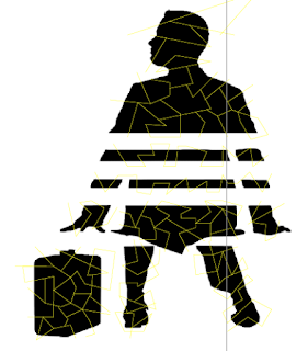
I traced this image from the movie and thinned the bench so that it could be bigger on the stamp.
Then I marked out the different sections to add my coloured photographs that will make up the collage.
Here are the bench slats covered in white photographs. In the movie this part is brown but I would like Forrest to be in black and so I made this white so that he stands out.
The bench posts are made up of brown photographs.
Forrest is made up of black photographs.
I initially tried a blue background (like his shirt in movie) but I prefer pale yellow (like the ribbon of the chocolate box)
The Godfather Stamp:
I took the Marlon Brando vector and marked out sections to apply my photographs to.
I wanted to use roses somewhere so I decided to apply the photographs of roses to each section.
Here is the finished vector. The different rose photos are mis matched so that the overall vector has a texture no matter the size. The white background is too stark and needs to be more dramatic for this mafia movie.
Black makes the details of the face harder to see and it is unrecognisable as Marlon Brando.
The grey works a lot better - however, maybe a lighter shade would work better.
Here is my final Godfather stamp. Even at the small stamp size you can see that it is Marlon Brando.
Match Box:
I started by taking my drawing of the main character (Walter White/Heisenberg) and drew the lines over the vector to separate where I could put the photographs and create the collage.
Then I took it into Photoshop and began to add my blue photographs into the sections...
...and continued to add my photographs...
...and finally I have a finished collage.
I then needed to decide the background colour.
Green is the colour of the logo so I tried that first but it clashes against the blue.
Yellow for the colour of their hazmat suits looks too bizarre with the collage
Pink for the colour of the teddy bear takes your eye away from the collage.
Black feels too intense behind the collage, a lighter colour would keep focus on collage.
Light grey works better but I feel keeping it white would let the collage be the soul design feature and to keep it more minimal.
The front of the match box...
I put a blue box for the text caption to unite the two and give it a heading so that people can distinguish the purpose of the matchbox design.
I wanted a more interesting strike strip so I made a hexagon and duplicated it multiple times to fill the strike strip.
Now for the back of the matchbox I decided to use the logo and do the same collage technique.
Here is my final Match Box design. I have included the collection title and 'safety matches' (which was a requirement)


No comments:
Post a Comment