Thursday 7 May 2015

Activity 1: Research

Range of Examples of Designs...

Here are a few designs I like the style of with an assessment of what method has been taken to make it.


Research from past projects that could be influential for this project...

This mixed media collages from my 'digital imaging' unit is really inspiring me for this unit. I particularly like this photo of men with patterned jackets which has been made in Photoshop by highlighting their jackets and applying a pattern to the area. I may try something like this for my match box as it mixes the old fashioned (using matches) with a fun twist that gives it new life.

Here is a typography mood board from my 'Expressive Type' unit as I am quite keen to have a typography design for either my stamps or match box so this mood board is helpful to see how my type could be displayed.


Stamp Design Mood Board...


L.A. Stamp Examples...

As most stamps have elements that have to be included depending on the location. As I would like to have stamps based on Oscar winning movies it would be for the city of Los Angeles so I looked into existing L.A. stamps to see what elements have to be included.

More stamp designs I like the look of...

I have included these because they show characters or typography within the small space of the stamp.

Design Style Mood Board...

I really like the use of bold colours in all of these pieces of design as it is a way to quickly attract your eye.

I have this book called 'Wreck This Journal' and one of the pages asks you to paste in all of the stamps you find along the way. Here is my page with some stamps (some real some are just fake but they are all really nicely designed) I love the detailed but simple illustrations on each stamp and the bold colours used. It is clear that they maximise the space of the stamp to ensure the graphic can be understood.

My Dad collected match BOOKS growing up and last year I framed them for him - I know they aren't match boxes but they use bold colours, typography and illustrations on a small scale quite nicely.

Wednesday 6 May 2015

Activity 2: Idea Generation

Here is a brainstorm of possible ideas for my stamp designs...

I have decided to go with stamps based on movies that have won an Oscar for Best Picture as I have a big passion and love for movies so it is a subject I can put my own interests into. I have decided to design my stamps first because it requires four designs versus the two for the match box so I would like to get them in the bag and know how much time I have left for the match box.

Here is a mood board for each of the four movies I want to base my stamps on...

I have also displayed a colour scheme and quote for each of the films. The images will help me show the film in an easy to recognise design.


Here is a brainstorm of possible ideas for my match box designs...

Here is a mood board some existing match boxes I like the look of...


I liked the idea of having movie quotes to continue the theme from my stamp designs. Here are some quotes I like...

Typography mood board - this will inspire me to display the quotes in an interesting and mixed media format.


I decided to change my match box theme to "Emmy Winning TV series" because I really wanted to have a Breaking Bad design. Here is some research into the TV series, colour schemes & existing mixed media art outcomes.


The colour scheme is quite varied but I think I will be going down a blue theme (the colour of the Chrystal meth they make in the show)
I love these existing pieces of art - they are so varied and unique. There are a lot of details which may be harder to see at the size of the match box but it is still important to have those features that people can focus on. I really love the use of mixed media as you can build up depth and texture to make your design more interesting.

Tuesday 5 May 2015

Activity 3: Development & Experimentation

Stamps

Here are my initial sketches for each of the movies my stamps are based around. This will get me thinking of which visual I want to develop for my stamp.

Mixed Media Experimentation

Rain Man...
I think my favourite visual for Rain Man is the matchsticks.
In the movie, a box of matches falls on the floor and the lead character, Raymond who has autism, knows instantly how many matches are on the floor.
It is the simplest vector from the movie

Titanic...
My favourite vector from Titanic is the 'Heart of the Ocean' necklace as it is instantly recognisable from the movie and could be easy to recognise on a small scale of the stamp.

Forrest Gump...
There is a lot of famous visuals from Forrest Gump but I would like to go with the bench scene as it shows the main scene from the movie.

The Godfather...
This is a difficult one as I don't want to go too gory as this stamp could be seen by any age of person and I want it to be appropriate for the masses. The vector of the main character (played by Marlon Brando) is probably the most iconic but I like the idea of roses as well (Brando has a closed rose in his jacket)

Here is an initial design using the image of the cat (well known scene in the movie where Marlon Brando's character strokes a cat whilst delivering his famous lines) and the name of the movie is fitted within the shape. I like this a lot but I don't think this concept will work as well for the other movies.


Match Box

I initially sketched some vectors and quotes from the TV series, Breaking Bad, to get thinking of which could work on the match box.

I then experimented with more detail and colour used mixed media. I used water colours, felt tips, acrylic and poster paint.


Monday 4 May 2015

Activity 4: Refinement & Production

Stamps:

Rain Man Stamp:


For my match vector I traced over an image of a match and marked out the areas to apply the photos to.

Here are a few of the photographs I used for this collage.
The red is from the corner of a piece of artwork I saw in a magazine
The middle cream one is my carpet
The last one is a cream tote bag I have

Here is the outcome. I used the magic wand in Photoshop to select an area one of the sections and then pasted my image (which became a new layer)

Then I duplicated it and layered it randomly to build up the scene of matches dropped on the floor.

I used a pale blue background because as Raymond and Charlie are travelling there is a lot of blue skies and they both wear light blue jeans.


Titanic Stamp:

I have decided to make a collaged version of the 'Heart of the Ocean' necklace from the movie.
First I drew out lots of shapes over the blue pendant to add the images that will make up the collage.

I took it into Photoshop and began to add in my blue coloured photographs which included the following three...


Here is the finished heart shape. I different photos represent the way the pendant looks as the light bounces of the jagged edges.

I then placed the finished vector with the diamond outline and necklace chain into the stamp mockup. I have added the Los Angeles stamp requirements, the movie title and the collection name 'Oscar Winning Movies Collection'.
I initially tried a black background but it is too harsh against the necklace.

I then tried this bright purple but it is too vibrant for this romantic drama.

I tried a deep navy blue and feel it works well behind the necklace. It is a common colour throughout the movie so it is a good fit.
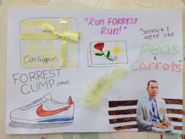
Forrest Gump Stamp:

I traced this image from the movie and thinned the bench so that it could be bigger on the stamp.

Then I marked out the different sections to add my coloured photographs that will make up the collage. 


Here are the bench slats covered in white photographs. In the movie this part is brown but I would like Forrest to be in black and so I made this white so that he stands out.

The bench posts are made up of brown photographs.

Forrest is made up of black photographs.

I initially tried a blue background (like his shirt in movie) but I prefer pale yellow (like the ribbon of the chocolate box)

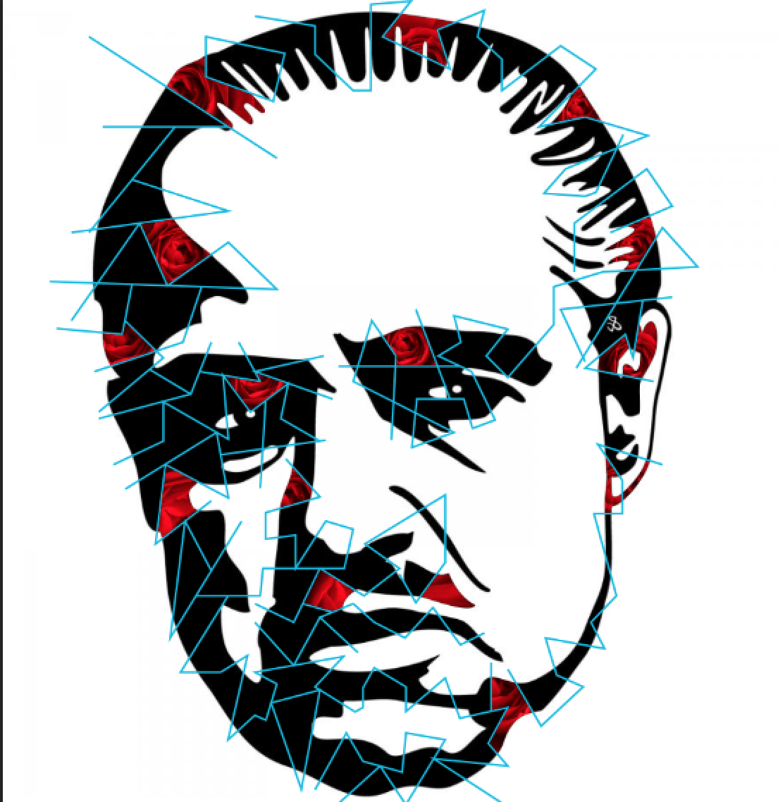
The Godfather Stamp:

I took the Marlon Brando vector and marked out sections to apply my photographs to.

I wanted to use roses somewhere so I decided to apply the photographs of roses to each section.


Here is the finished vector. The different rose photos are mis matched so that the overall vector has a texture no matter the size. The white background is too stark and needs to be more dramatic for this mafia movie.

Black makes the details of the face harder to see and it is unrecognisable as Marlon Brando.

The grey works a lot better - however, maybe a lighter shade would work better.

Here is my final Godfather stamp. Even at the small stamp size you can see that it is Marlon Brando.


Match Box:

I started by taking my drawing of the main character (Walter White/Heisenberg) and drew the lines over the vector to separate where I could put the photographs and create the collage.

Then I took it into Photoshop and began to add my blue photographs into the sections... 


...and continued to add my photographs...


 ...and finally I have a finished collage.

 I then needed to decide the background colour.
Green is the colour of the logo so I tried that first but it clashes against the blue.

Yellow for the colour of their hazmat suits looks too bizarre with the collage
Pink for the colour of the teddy bear takes your eye away from the collage.

Black feels too intense behind the collage, a lighter colour would keep focus on collage.
Light grey works better but I feel keeping it white would let the collage be the soul design feature and to keep it more minimal.

The front of the match box...
I put a blue box for the text caption to unite the two and give it a heading so that people can distinguish the purpose of the matchbox design.

I wanted a more interesting strike strip so I made a hexagon and duplicated it multiple times to fill the strike strip.

Now for the back of the matchbox I decided to use the logo and do the same collage technique.


Here is my final Match Box design. I have included the collection title and 'safety matches' (which was a requirement)